


 This logo is similar to Classic FMs in a way, due to it's simplicity. The reason why I looked at this logo is due to the brands name. Though a relatively bland design, the '&' symbol has been embellished to draw attention to the centre of the logo. Perhaps in my designs I could make the '&' the focus of the logo.
  This logo incorporates a music note too, but not in place of a letter. I like the use of combining a theme from the brand name, 'bird', with a music note. In my interpretation of the design, I used a griffin with a music note. With more development into griffin designs, they will most likely feature in my final piece.

 In my interpretation of the design, I used the forte note within 'GRIFFIN'. To explore the use of music notes further, I could have used a treble clef. Using music notes in place of letters is something I will explore further.
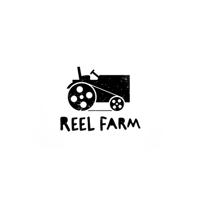
  I like the way the logo has combined both parts of the brands name into one image. The use of reels as the tyres is very smart. I also like the styling of the logo; the rugged, not quite fully coloured in tractor gives the impression it's an image from a reel of film and the picture quality is low. The choices of colour also give the impression the image is from an old film reel, hence the black and white. In addition, the font used is well suited to the picture. It doesn't quite sit neatly on one line, again giving the impression that it's rugged.
  In my interpretation of the logo, I used an image of a griffin. I could have used a green coloured pen to incorporate both aspects of the brand's name into the logo, but I followed the theme of black and white as used in the original. I would like to include a griffin in my logo design. I will continue to experiment with different themes and ideas including griffins.
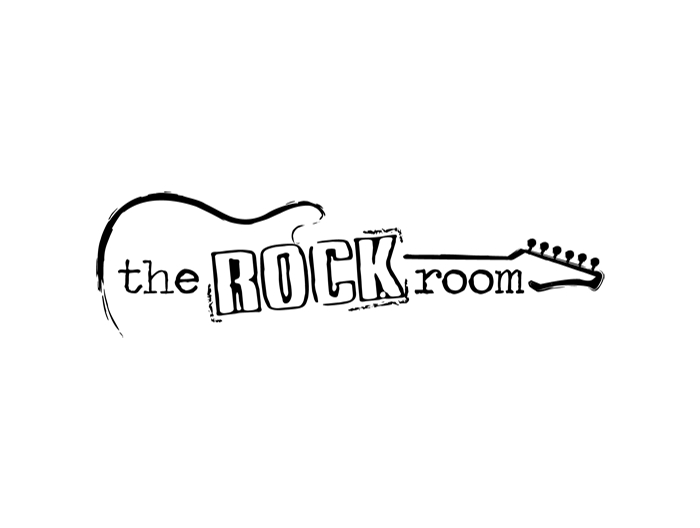
 This logo design also features a guitar. However, unlike Sonica's logo, the guitar is only featured as a background image rather than incorporated into the text.
  I like the sketchy outline's of the guitar to make the brand seem edgy. I also like the use of capital letters for 'ROCK' to draw attention to it and make it stand out from the other words. The outline around it too adds impact and separates the word from the others. The use of a relatively plain font for 'the' and 'room' makes it seem as if the 'ROCK' is bursting through, demanding attention.
  |
| Click here for my analysis of this logo |
 |
| Click here for my analysis of this logo |
 |
| Click here for my analysis of this logo |
 |
| Click here for my analysis of this logo |
 |
| Click here for my analysis of this logo |
 |
| Click here for my analysis of this logo |
 |
| Click here for my analysis of this logo |
 |
| Click here for my analysis of this logo |
 |
| Click here for my analysis of this logo |
 |
| Click here for my analysis of this logo |
 |
| Click here for my analysis of this logo |
 |
| Click here for my analysis of this logo |


 The A and M have been combined to look as if they form mountains. Auckland is a mountainous region of New Zealand, home to Mount Eden. I like the idea of involving themes within the logo, and may apply the idea to designs for Griffin & Green. The colour choice may have been influenced by Mount Eden also, as it is largely grassland.

